
In September 2022, a serendipitous moment occurred for Kamilia when she read an article by Patagonia founder Yvon Chouinard discussing the company “going purpose” instead of “going public.” “That very evening I received an email from a former client from the Aga Khan Foundation (AKF) asking if I was open for working on a branding project.”
Later the same evening she received an email from Home Planet Fund’s (HPF) Executive Director Dilafruz Khonikboyeva.
“And that’s when I realized the branding project my client mentioned was with Home Planet Fund,” she explained with a smile. “It was a dream come true!”
Born and raised in Kyrgyzstan and of Uighur and Polish heritage, Kamilia studied and worked in Malaysia for five years, before returning to her home country where her work as a graphic designer began to flourish and include clients like AKF and USAID. With an eye for creating visual and verbal identities for her clients, crafting style guides and developing brand strategies became her forte, along with working as a creative supervisor.
HPF wanted to offer our readers, supporters, and followers a chance to get to know the person we are proud to be working with.
HPF
When you were introduced to what Home Planet Fund was about, what were your initial impressions of our mission, aims, and what we are working towards for the planet?
Kamilia
The more I learned about Home Planet Fund and the people who work there, the more excited I became. My initial reaction was a resounding “Yes” — this is precisely what humanity needs right now. It struck me how HPF combines innovation with tradition to tackle the environmental crisis, championing community-led, nature-based solutions. It’s fascinating how HPF embodies the idea that sometimes, the best way forward is to revisit the wisdom of the past. This harmony between the old and the new is what makes HPF’s mission so compelling and trustworthy.
HPF
How did this influence your thinking and feelings about crafting our style guide, the very Earthy primary colors you chose for the website, and your choice of font?
Kamilia
Inspired by HPF’s deep commitment to nature, I immersed myself in the study of traditional Earth pigments, which are steeped in history and significance across cultures. This exploration led me to choose an Earthy color palette that echoes HPF’s ethos.
For example, burnt umber, one of the HPF’s primary colors, is a natural brown Earth pigment. Along with ochre, it was one of the first pigments to be used by humans and is found in many cave paintings. With its rich history in human artistry, it became a cornerstone of our visual identity.
The choice of Oli Grotesk as our primary font was suggested by Amanda from Teal. [Amanda Buck is the Art Director for Teal Media, who HPF works with.] This font was developed by Indian graphic designer Shiva Nallaperumal and intended to be used to write traditional Indian scripts alongside Greek, Cyrillic, Armenian and Latin versions. It is both a distinctive and expressive font with an unreserved personality that is functional and easy to read. Its ability to bridge traditional scripts with contemporary design made it an unparalleled choice, reflecting HPF’s innovative yet grounded spirit.
HPF
With virtually a blank slate to work from, what made you decide to go with glyphs instead of something else for a logo?
Kamilia
At the core of HPF lies the idea of unity and shared heritage. I wanted to find ways to connect with everyone, no matter where they’re from or what language they speak. That’s when I thought about glyphs.
Glyphs, being among humanity’s earliest forms of communication, offer a universal language that transcends cultural and linguistic barriers. This timeless medium felt like the perfect way to encapsulate HPF’s mission, connecting us all to our collective roots and to each other, embodying the shared responsibility we have towards our planet.
HPF
What does each glyph symbolize to you, and how do they bring Home Planet Fund’s mission to the fore?
Kamilia
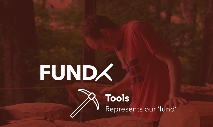
The three primary glyphs represented in the logo — ‘Lands & Waters,’ ‘Tools & Seeds,’ and ‘Communities’ — are symbolic pillars of HPF’s mission. They represent the fund’s commitment to empowering marginalized communities and fostering collective knowledge and action. Together, these glyphs not only form a cohesive identity but also a dynamic narrative of HPF’s poly-cultural strategy and vision.
What excites me about this concept is the potential to establish a ‘glyphoteque’ for various partners and projects as we progress. This will serve to showcase the uniqueness of each partner we collaborate with.


HPF
We are very keen on the animation of the glyphs, and how our name arises from them on various places on the website. Please describe your process of how this idea came to fruition.
Kamilia
The concept of a dynamic logo emerged from the desire to mirror HPF’s readiness to adapt and take action. By animating the glyphs, we not only bring the essence of HPF to life but also illustrate the interconnectedness of our actions and their global impact. This evolving logo design represents the idea that we are all part of a larger, interconnected puzzle, emphasizing the importance of collaboration and adaptability in addressing global challenges.
HPF
Anything else you want to add that you think our supporters and visitors should know about?
Kamilia
I am incredibly honored to contribute to HPF’s mission through design. This opportunity to work alongside people who are deeply committed to our planet has been profoundly inspiring. My goal was to craft a visual identity that not only complements but actively promotes HPF’s vital mission. I hope it resonates with our supporters as a symbol of what we can achieve together for our planet.
HPF
Home Planet Fund thanks for your hard work and support for our mission.